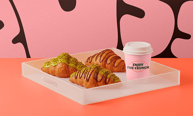
CROISS isn’t just a bakery — it’s a mood.
It’s a brand that speaks in textures, colors, and characters long before you take that first bite.
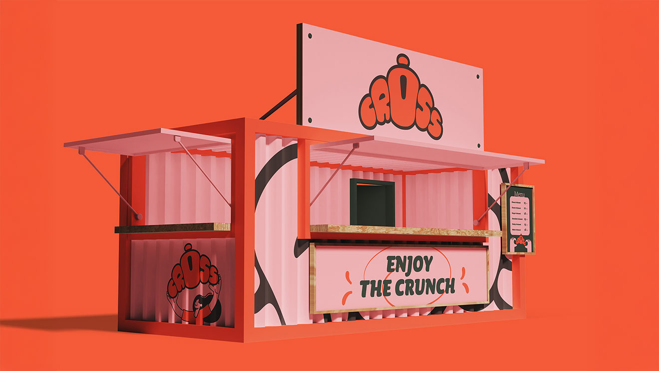
Branding & Packaging
2025
Bakery
CROISS isn’t just a bakery — it’s a mood.
It’s a brand that speaks in textures, colors, and characters long before you take that first bite.
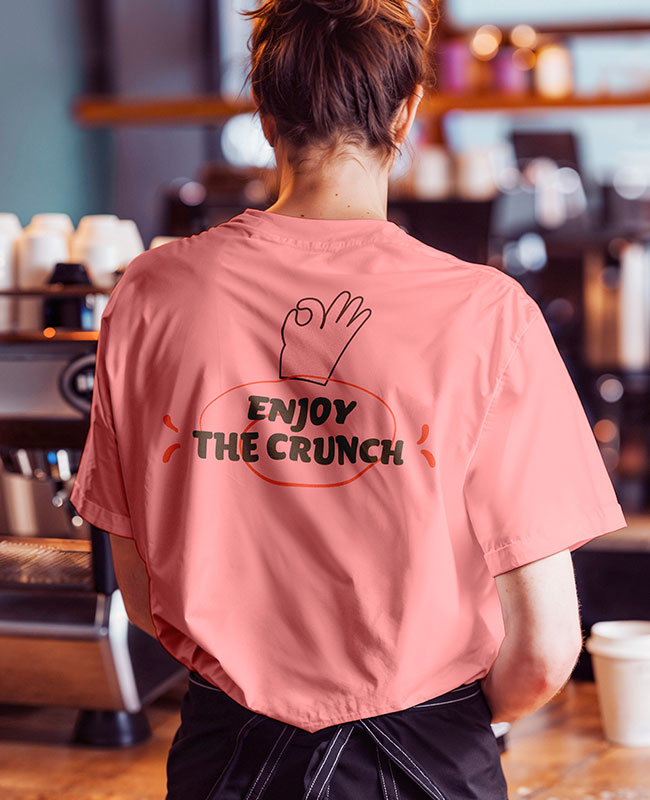
Branding
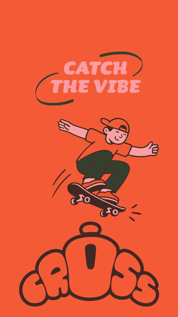
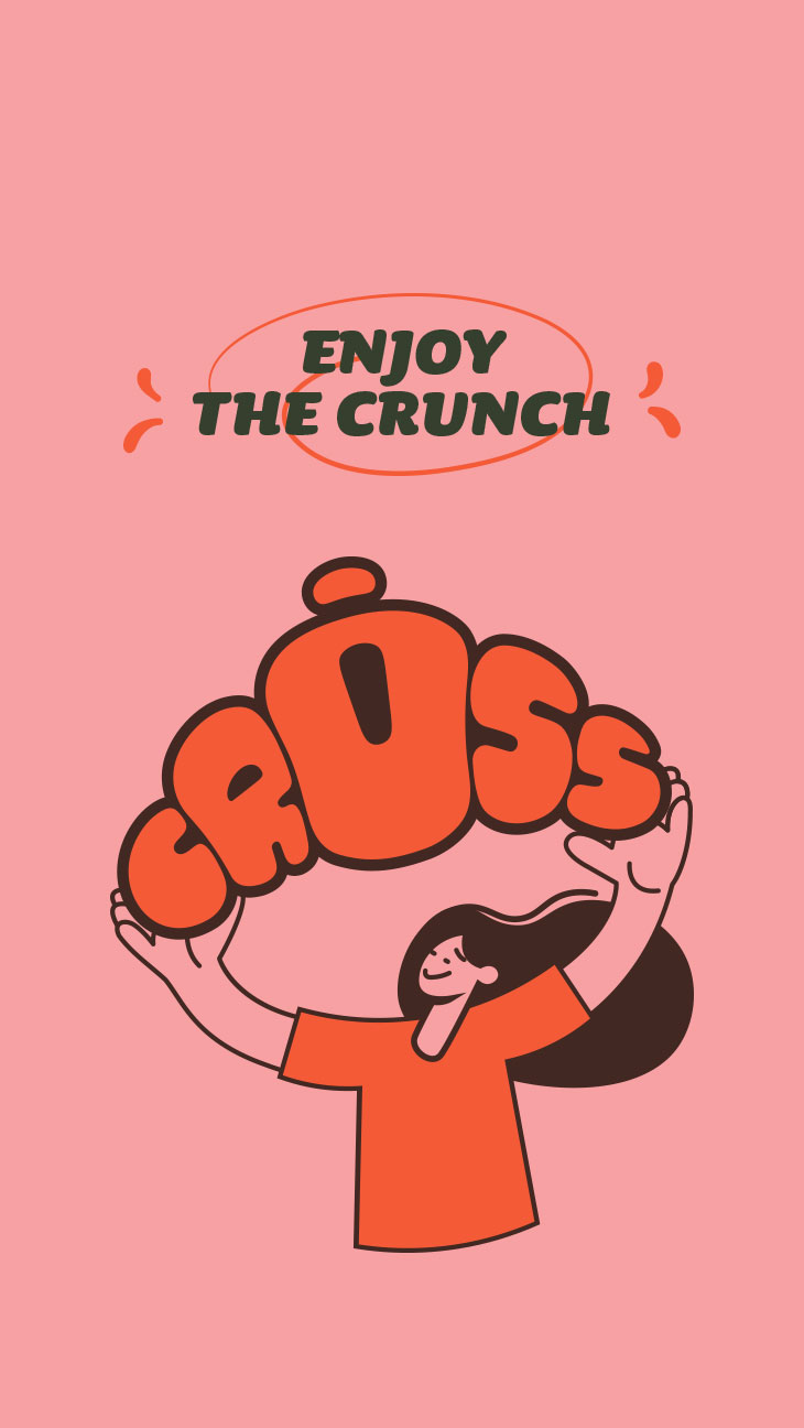
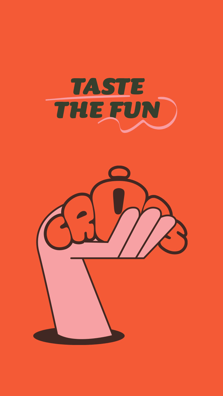
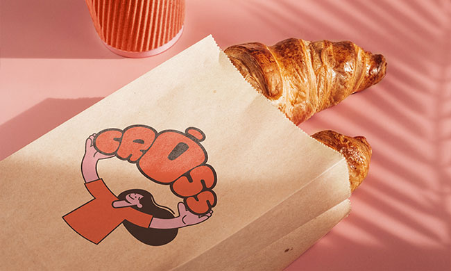
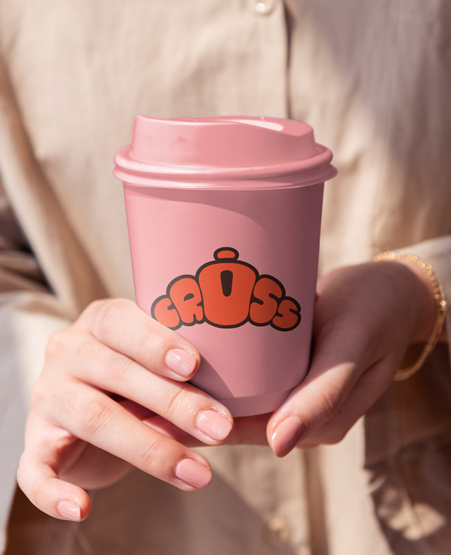
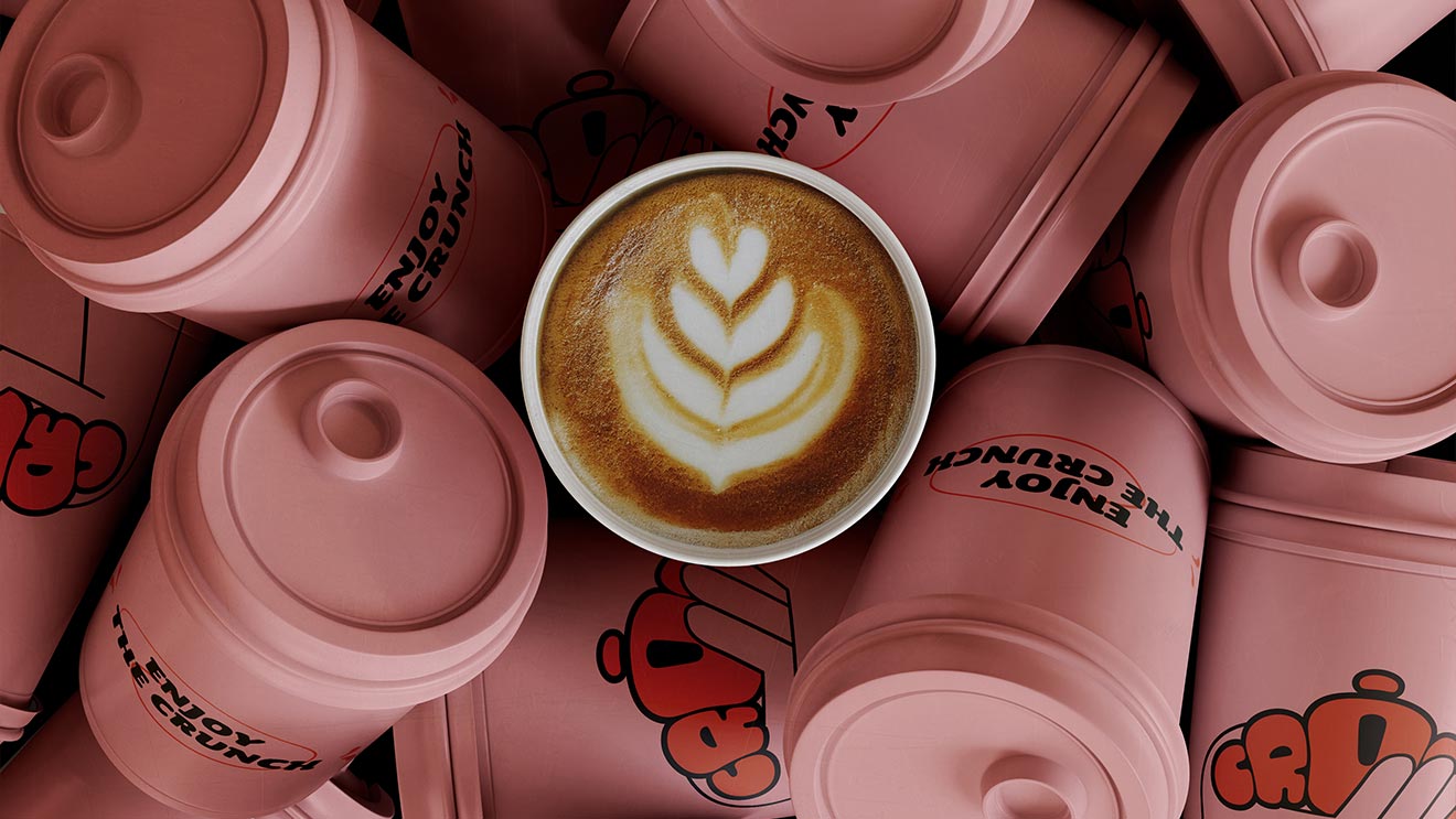
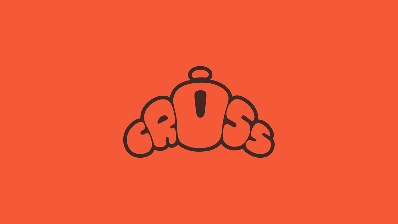
We designed CROISS to feel instantly memorable and playful.
The logotype mimics the shape of a croissant — rounded, warm, and bold — while the custom typography makes the name pop visually and phonetically.
Every detail is crafted to communicate flavor, fun, and familiarity.
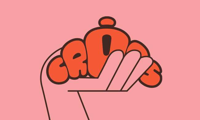
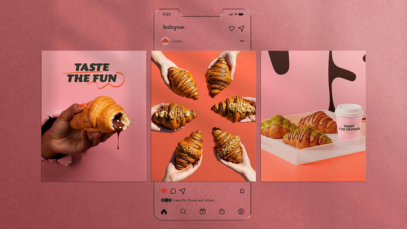
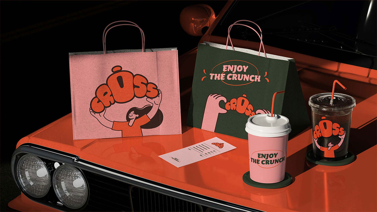
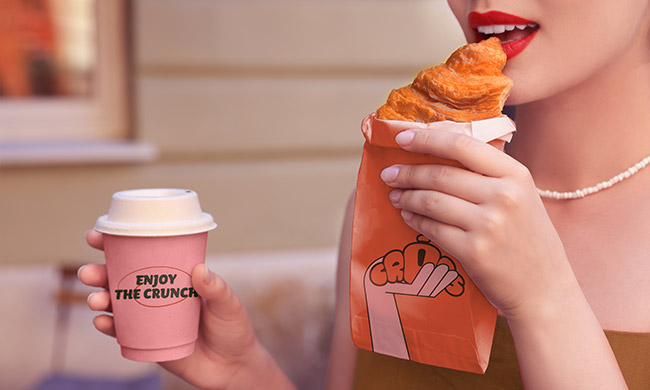
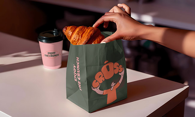
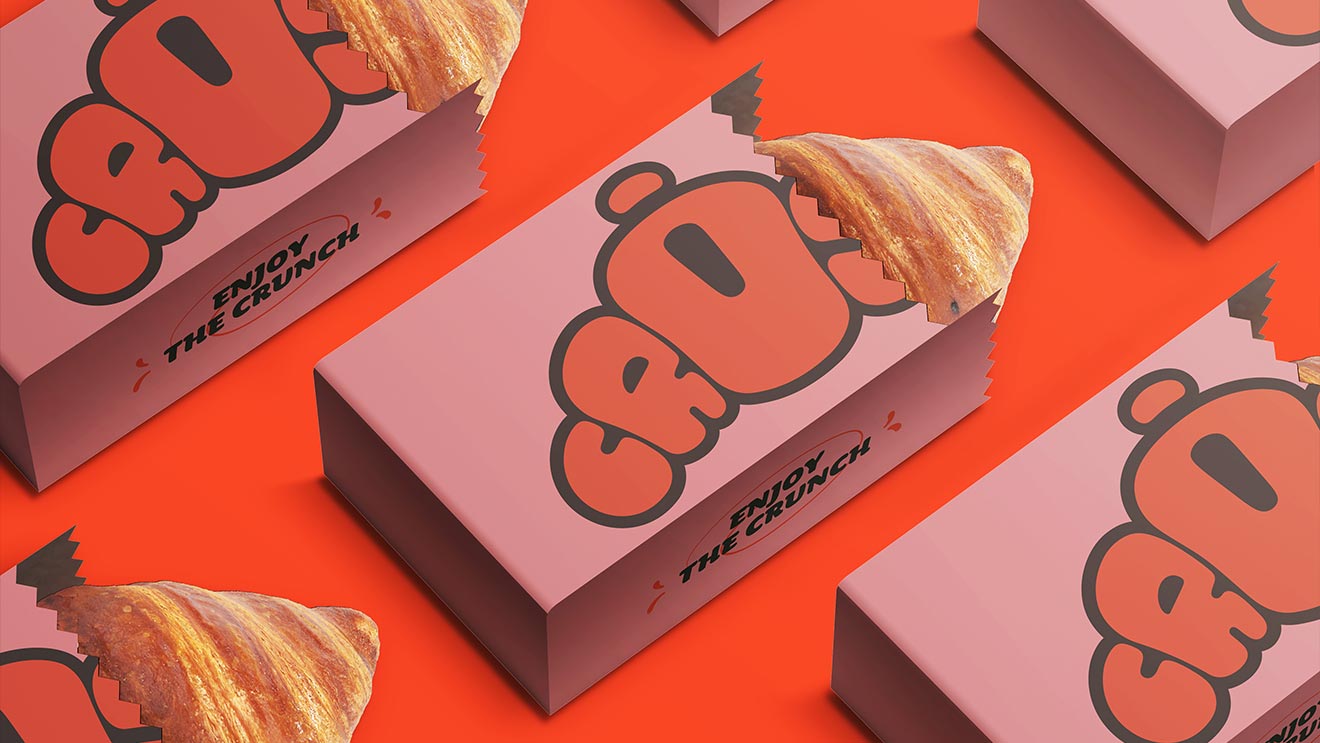
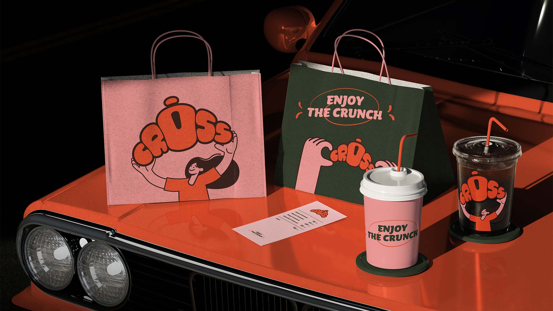
The illustration style is key to the CROISS experience.
It’s not decoration — it’s narrative.
The characters interact with the product (holding it, lifting it, crunching it), adding a human connection and a sense of joy.
We built a system of modular hands and faces that playfully frame the logo and direct attention to the product.
The simplicity of the linework balances the boldness of the color and logo.